

Hi AnneOriginally Posted by picaflor-azul

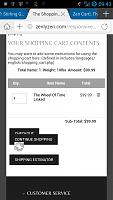
it's trivial but I thought you'd wanna know anyway... slight overlap in shopping cart when viewed on phone

Results 1 to 10 of 527
Hybrid View
-
9 Oct 2013, 09:18 PM #1
 Totally Zenned
- Join Date
- Dec 2010
- Location
- UK
- Posts
- 1,771
- Plugin Contributions
- 3
 Re: Stirling Grand Responsive Template
-
9 Oct 2013, 09:27 PM #2
Totally Zenned
- Join Date
- Jul 2009
- Location
- picaflor-azul.com
- Posts
- 6,928
- Plugin Contributions
- 45
Re: Stirling Grand Responsive Template
Thanks for posting ;) Which phone are you using? Originally Posted by picandnix
Thanks,
Anne
-
9 Oct 2013, 10:51 PM #3
Totally Zenned
- Join Date
- Dec 2010
- Location
- UK
- Posts
- 1,771
- Plugin Contributions
- 3
Re: Stirling Grand Responsive Template
Samsung Galaxy S4 Originally Posted by picaflor-azul
-
11 Oct 2013, 10:54 PM #4
Totally Zenned
- Join Date
- Dec 2010
- Location
- UK
- Posts
- 1,771
- Plugin Contributions
- 3
Re: Stirling Grand Responsive Template
Can I throw in an 'observation' please... it applies to Carlisle Fresh too. The magnifying glass/search icon isn't 'clickable' unlike on your other templates.
Petty I know but you can bet your bottom dollar it'll make some customers scratch their head right?
-
12 Oct 2013, 02:08 PM #5
Totally Zenned
- Join Date
- Jul 2009
- Location
- picaflor-azul.com
- Posts
- 6,928
- Plugin Contributions
- 45
Re: Stirling Grand Responsive Template
No, I appreciate any input :) The look is much cleaner without the button and I am assuming that most users will not be confused by just hitting enter after they type their search terms, but I do see your point. If you want the button back, you can add it to the includes/templates/stirling_grand/sideboxes/tpl_search_header.php file. Just grab the code from the template_default file ;) Originally Posted by picandnix
Thanks,
Anne
-
13 Oct 2013, 02:30 AM #6
Totally Zenned
- Join Date
- Aug 2009
- Location
- North Idaho, USA
- Posts
- 2,008
- Plugin Contributions
- 1
Re: Stirling Grand Responsive Template
I know you have worked hard to put these responsive template together and it is difficult to anticipate every possible scenereo. Nice look Anne from desktop computers. I finally got tired of futzing around with Resp Shefield Blue and Resp AB and thought to try this one, which seemed fitting since most of our sales are Sterling.
Stirling installed without a hitch, I have yet to obtain a good functional install of the other 2.
There seems to be an issue with the Header buttons on my touch devices. Everything works as expected (so far) on desktop with a mouse. The Shop button functions as expected only every other time on my Window8 Pro tablet/FireFox 23.0.1. Just updated to FireFox 24.0 and functionality is different and worse (about the same as on my SurfaceRT). Sometimes the flyout disappears before I can get my finger to the next button. On the WindowsRT tablet, the header menu may as well not exist because there is no functionality at all.
Android ver 98.15.66, Motorola RazR-M . Display is about 4 screens wide in the portrait position instead of the width of the mobile device.
I am having trouble finding a "HOME" button on secondary pages other than the breadcrumbs and my fingers are too big to use that. No problems finding the Home button on the Home page.
To rule out the possibility of install issues, the above observations were made using your demo site instead of my install, though it was nearly identical.
Minor issues are alignment which does not affect functionality.
I could use any pointers that you may have.... OOPS.... internet connection seems to be dying......Rick
RixStix (dot) com
aka: ChainWeavers (dot) com
-
13 Oct 2013, 02:53 PM #7
Totally Zenned
- Join Date
- Dec 2010
- Location
- UK
- Posts
- 1,771
- Plugin Contributions
- 3
Re: Stirling Grand Responsive Template
For anyone interested, I have a live install of Stirling Grand at www. tkdrevision .com
I too installed several of Anne's awesome responsive templates, I think I've settled for this one though...
Rixstix I don't have any of the hardware examples you are using to test out so I'd be interested to know how my site measures up for you please.
-
13 Oct 2013, 03:04 PM #8
Totally Zenned
- Join Date
- Jul 2009
- Location
- picaflor-azul.com
- Posts
- 6,928
- Plugin Contributions
- 45
Re: Stirling Grand Responsive Template
What screen resolution is your windows tablet? If it is greater than 1024 pixels wide then you will see the full size version which uses the css mega menu. The css mega menu is not touch friendly. You would have to either change the menu or convert the mega menu to be touch friendly. Originally Posted by RixStix
I have tested on the following: iPhone 5 with Mobile Safari 6.0; iPad 4 with Mobile Safari 6.0; Windows Phone 8 with IE10 Mobile; Blackberry Bold 9900 with Blackberry Browser 9900; and Android Nexus 4 with Chrome Mobile 18, Dolphin Mobile 9.3, Firefox Mobile 19, Marathon Mobile 4, Opera Mobile 12, Sleipnir Mobile 2.9. If you are viewing on a different device then it has not been tested. This is a free template and while I will do my best to always improve it, I would be surprised if it were perfect on every mobile device ever created ;)
Thanks,
Anne
-
14 Oct 2013, 01:38 AM #9
Totally Zenned
- Join Date
- Jan 2007
- Location
- Los Angeles, California, United States
- Posts
- 10,021
- Plugin Contributions
- 32
Re: Stirling Grand Responsive Template
I have the same issue with the mega menu on my phones and tablets. The biggest issue is that there is no such thing as an "onhover" or "onmouseover" event for touchscreen devices.. To remedy this, when I use this template (hoping to do so soon), I'm thinking that I'm gonna swap the included mega menu out with a responsive megamenu which supports "onclick". This will work well for both desktops and larger touchscreen devices.. Originally Posted by RixStix
My Site - Zen Cart & WordPress integration specialist
I don't answer support questions via PM. Post add-on support questions in the support thread. The question & the answer will benefit others with similar issues.
-
5 Dec 2013, 05:58 PM #10
New Zenner
- Join Date
- Oct 2013
- Location
- Norge
- Posts
- 13
- Plugin Contributions
- 0
Re: Stirling Grand Responsive Template
I have big problems with Stirling Grand Responsive Template when I use the Norwegian translation, can anyone help?

 Reply With Quote


Similar Threads
-
Responsive All Business Template
By picaflor-azul in forum Addon TemplatesReplies: 392Last Post: 3 Oct 2019, 05:42 AM -
v154 Best Responsive Template
By martynbaker52 in forum General QuestionsReplies: 4Last Post: 12 Sep 2015, 02:35 AM -
v151 responsive template problems
By irishshopper in forum Templates, Stylesheets, Page LayoutReplies: 1Last Post: 23 May 2014, 07:11 AM -
Stirling Grand Template blank product info page
By Pablo_escobar in forum Templates, Stylesheets, Page LayoutReplies: 9Last Post: 18 Jan 2014, 04:38 PM

